Create your fonts
I wrote my first children’s book called Home Taste. However, I faced a challenge while looking for fonts suitable for my picture book. So, I decided to create my font instead. Thankfully, I came across Calligraphr.com, a website that allows us to create fonts. The process is straightforward and user-friendly, all you need to do is download the template and start creating your letters. This is not a sponsoring blog*
Although the website does most of the job for us, there is still some basic typography knowledge you need to know before creating your fonts.
(1) Serif or Sans Serif
Type can be classified into two groups: Serif or Sans Serif. Serif has little ditties at the ends of the strokes, while San Serif does not. San means “without“ in French.
Serif is more “readable“in extended text, meanwhile, Sans Serif is better at reading in large and is more recognizable at a glance. We often use Sans Serif for a big title or the sign on the road.
Now, most of the books you have read are set in serif. Children’s or board books are set in Sans Serif because the fonts usually have a larger height or wider shapes.
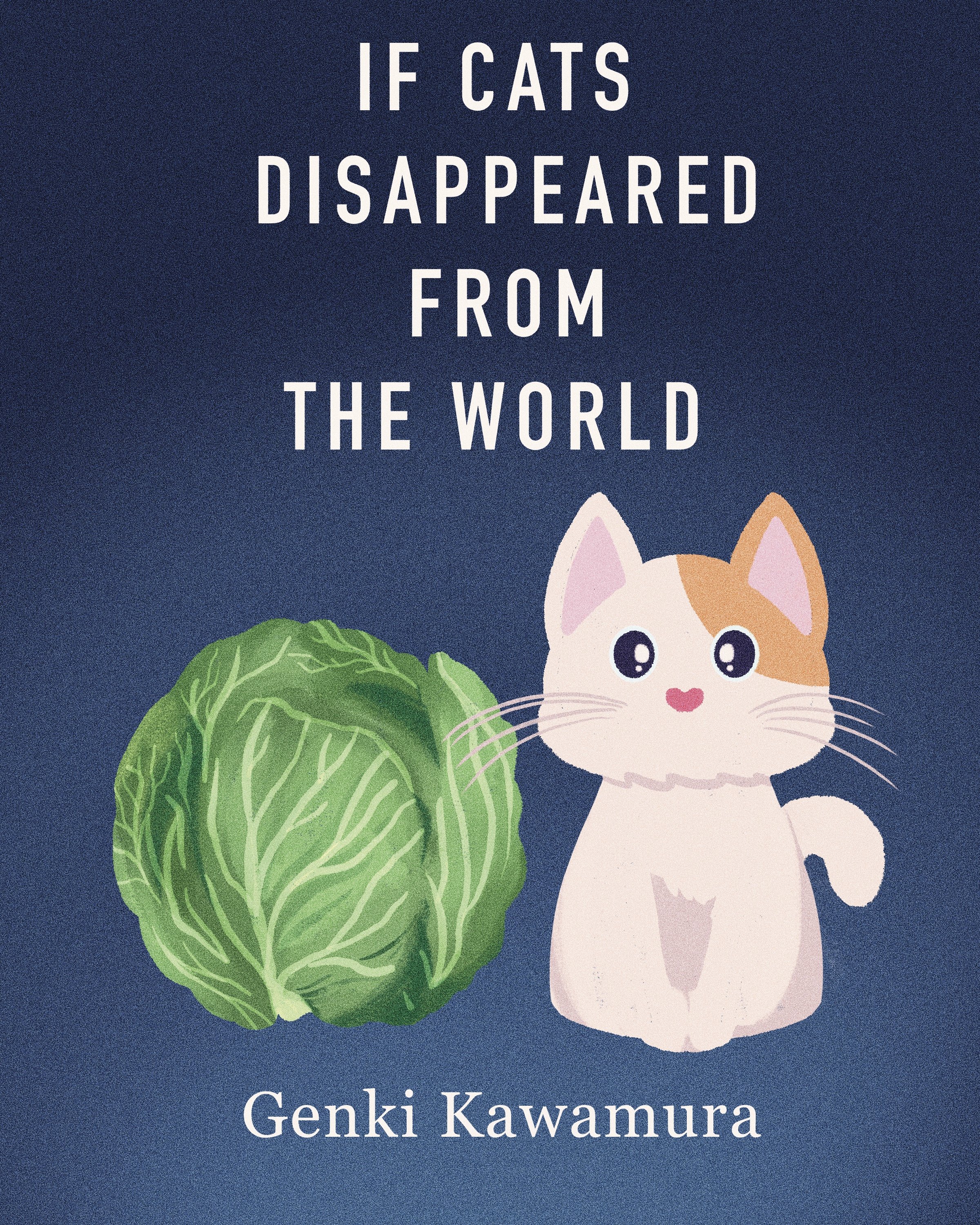
I created this cover illustration of my favorite book for fun. The title is huge and easy to read. When you are inside a bookstore, you will get attracted by the large titles and pick them first.
Another one. :)
(2) Typeface Design / The consistency of your typeface
A good and consistent typeface will allow you to read everything smoothly. There will be no interrupting unless your typeface has varying shapes and sizes. There are some keys you need to consider while you design the letters.
A good traditional strategy is to begin with three basic widths:
(i) A narrow width for letters like i, j, l, and t;
(ii) A wider width for letters like M, W, X, and Y;
(iii) A medium width for all the other letters like A, B, P, O, Q…
*I chose a monospaced font, so all of my letters have the same width.
Contrast is the next thing to take into consideration. Contrast in typography refers to the variance between the thick and thin letter parts. Each stroke weight has to match the contrast of every character.
*I didn’t create any contrast for my typeface because I used Procreate to draw every letter when I downloaded the template from the website.
(3) Test your letter pairs
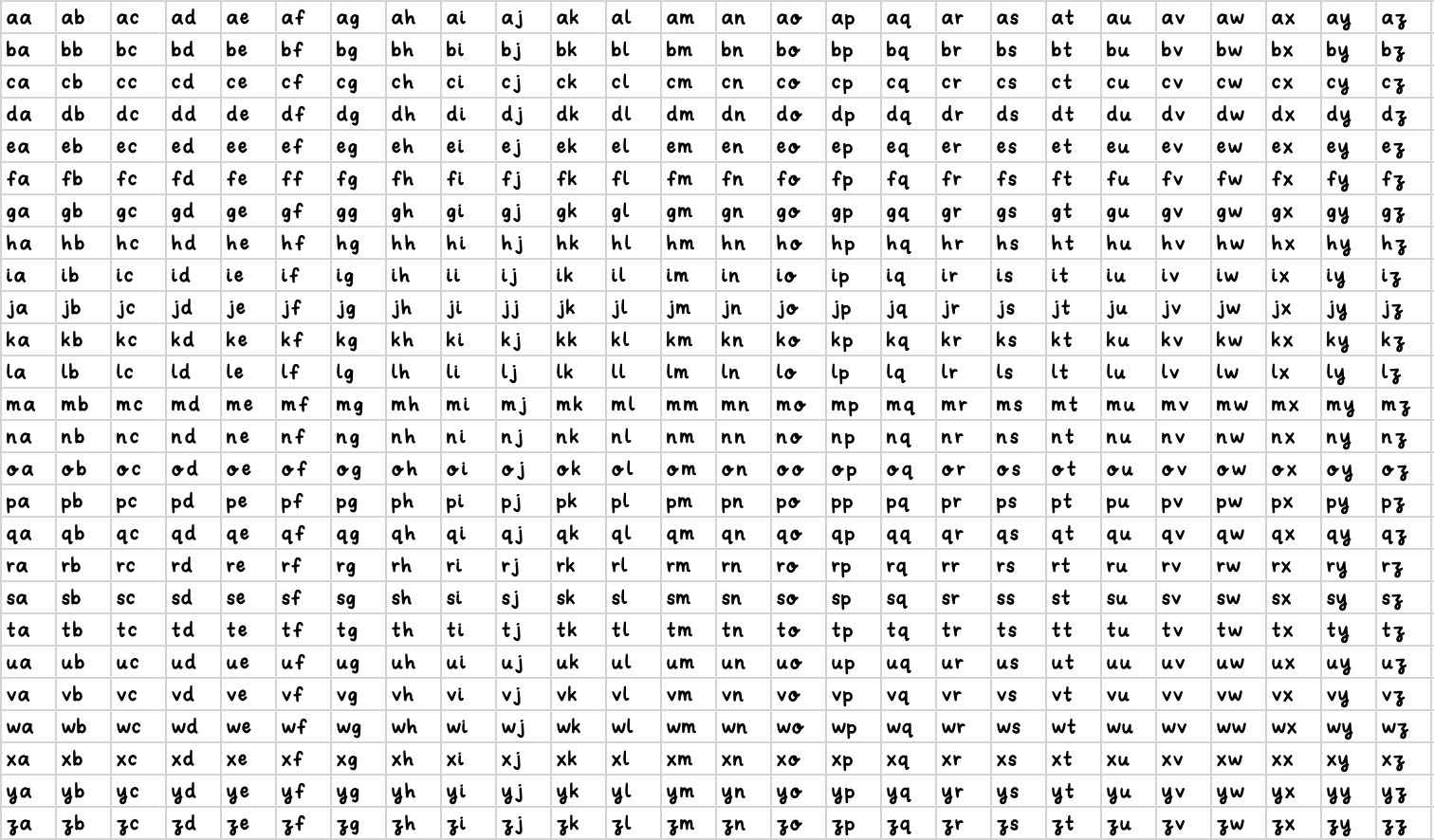
After you have finished designing your letters and feel satisfied with the spacing between them, it is time to focus on the kerning process. Even if your letters individually look great, the kerning might reveal some awkwardness. This stage aims to adjust the spacing between your letter pairs to appear more natural to the viewers.
(4) Reverse (white on black) characters
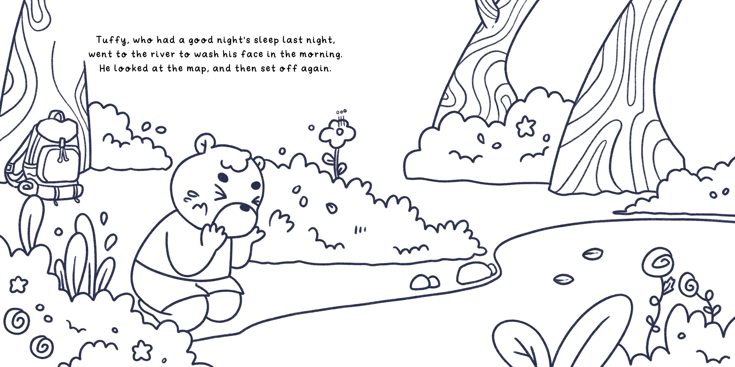
A spread from my latest and upcoming children’s book.
I enjoy looking at movie posters the most, followed by store signs and book covers. Summer is a great time to explore different movie posters! Now, let's take a look at some examples that I still like :)
From movies to cartoons,
designers used the same basic concept I mentioned above.
I realized that the typography design knowledge I have gained can be applied to various languages. This led me to consider creating unique letters for my children's book series. As you may already know, the characters in my children's book are from a different planet and reside on Coobie Island. Creating another language would have taken a long time, but creating another typeface? No! :)
Typeface Sketches
Typeface Sketch
That still look neat, isn’t? I love it! 😭


